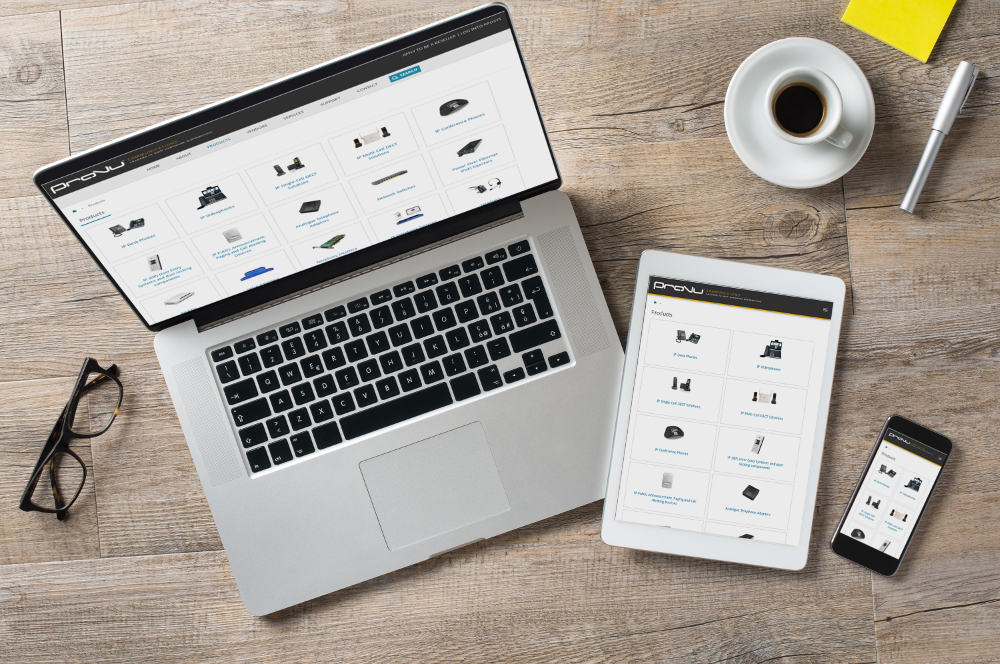
As a B2B distributor, the majority of users visiting our website are using desktop devices, but it’s no surprise that more and more users are finding us through their mobile devices – In fact 20% of our website views are now from mobile users.
So something needed to be done to make our site a little more user friendly for these users!
Our new mobile site is now up and running. We’ve adopted a simple method of creating a mobile style sheet – so that, the way our site is viewed, is different depending on the size of the screen / browser. This uses the same content as our main site so all the information you may need to access is still there – we don’t show you a cut down version of our site.

